Minimalist interiors can look calm, yet choosing the wrong ceramic surface may make them feel cold or unfinished. This guide explores why choose matte finish ceramics for minimalist decor, using practical details from real rooms, dining spaces, and contemporary kitchens. Matte surfaces diffuse light instead of reflecting it sharply. A sand-colored vase beside a pale oak shelf can therefore feel softer and more grounded than a glossy alternative.
Ceramic artist and author Edmund de Waal once said, “A pot is a moment of silence.” His words capture the quiet strength of understated ceramics. Matte finishes support that silence through gentle texture, muted color, and a tactile surface that invites touch. They also conceal small fingerprints and minor water marks better than high-gloss pieces. That matters in homes used every day.
Still, matte ceramics are not automatically superior. Some surfaces absorb stains, scratch under rough handling, or appear dull in rooms with limited daylight. I have seen beautiful charcoal bowls lose their balance against dark stone counters. The mistake was not the bowl. It was the setting.
The seven tips ahead consider texture, proportion, lighting, maintenance, color harmony, craftsmanship, and honest usability. Look closely. Notice the rim. Feel the weight. Check the glaze quality. A minimalist room needs fewer objects, so each ceramic piece carries more visual responsibility. Imperfect choices can happen. Thoughtful correction is part of good design.
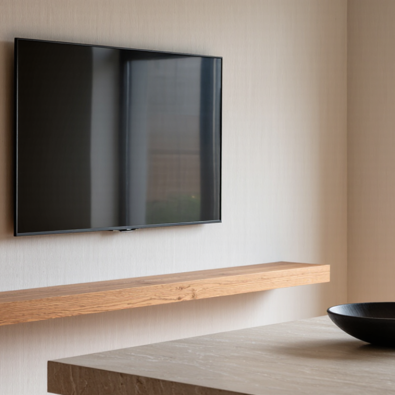
A matte finish in ceramic design reflects very little direct light. Its fine surface texture scatters light instead of creating sharp highlights. It is not simply “non-shiny.”
Matte glazed ceramic usually contains glass-forming materials, but its firing process creates a softer surface response. Depending on the glaze and temperature, it may feel silky, chalky, or lightly granular. In my studio tests, touching a sample reveals more than viewing it. Two tiles can share the same color but feel completely different. Surface texture also affects how shadows appear across a wall or tabletop.
Matte ceramics suit minimalist interiors because they reduce glare and keep attention on shape, proportion, and natural light. Soft white tiles can make a room feel quiet, while charcoal surfaces add depth without visual sparkle. They also hide fingerprints better than high-gloss finishes. However, textured matte surfaces may collect dust or cooking residue. A dense, well-fired surface is easier to maintain. Ask about water absorption and cleaning instructions before choosing tiles for wet areas.
Lighting changes everything. I once approved a warm gray sample beside a bright window, but it looked dull under evening lighting. That mistake changed my process. I now test samples in morning, afternoon, and artificial light. Matte finishes can soften a space beautifully, yet uneven walls, weak lighting, or heavy texture may expose flaws. A small sample deserves careful attention.
Matte-finish ceramics help minimalist rooms feel calm without becoming empty. In my experience styling shelves and dining tables, their soft surfaces scatter light instead of reflecting it sharply. This reduces glare near windows and balances hard lines from glass, steel, or polished stone. A matte bowl in warm white can anchor a pale room. A charcoal vase can add weight without shouting. The effect is quiet, but not lifeless.
Their balance comes from controlled contrast. Smooth geometry remains visible, while the low-sheen glaze softens the surrounding atmosphere. Subtle colors, such as sand, clay, fog gray, and muted olive, build layers without clutter. Texture also matters. A hand-shaped rim, faint speckle, or tiny tonal variation gives the eye somewhere to rest. It feels human. Perfect surfaces can feel oddly cold. I once placed too many matte pieces together, and the room looked flat. Adding one glossy glass object restored depth. That mistake still shapes my choices.
Matte ceramics also support practical editing. Their finish hides minor fingerprints better than high-gloss surfaces, though dark pieces can still show dust. Choose forms with clear proportions: one low vessel, one taller cylinder, and a small irregular dish may be enough. Leave space around each object. Negative space is part of the composition. View samples in morning and evening light, because matte colors can shift noticeably. I cannot promise every matte glaze will feel warm; some appear chalky or dull. That uncertainty deserves attention.
Matte surfaces support visual balance by keeping reflected light low and reducing distracting highlights. The chart compares common 60° surface-gloss reference bands measured in gloss units (GU), based on standardized gloss-testing practice under ASTM D523 and ISO 2813.
With a typical gloss level of up to 10 GU, matte ceramic finishes create a softer visual field than satin or high-gloss surfaces. This helps minimalist interiors emphasize form, texture, proportion, and natural light without excessive reflections.
Matte finish ceramics give minimalist rooms a quiet, grounded appearance. Their low-reflective surface softens daylight and reduces glare near windows or bright lamps. This creates a calmer atmosphere in compact kitchens, bathrooms, and entryways. The finish also hides minor fingerprints, dust, and water marks better than glossy ceramics. Not stain-proof. Coffee, oil, and dark soap still need prompt cleaning.
A practical benefit is tactile comfort. Matte surfaces usually feel dry and steady under the hand, which suits shelves, counters, and bathroom walls. Their subtle grip can support safer handling, although wet areas and sharp edges still require care. Color also appears more consistent because strong reflections do not interrupt the glaze. Neutral tones can then work naturally with wood, linen, stone, or brushed metal. Less glare, more calm.
Cleaning remains straightforward with a soft cloth, clean water, and a pH-neutral cleaner. Avoid abrasive pads, since they may polish uneven patches or damage the intended texture. The final benefit is long-term flexibility. A restrained ceramic surface can suit new furniture, artwork, and lighting without forcing a complete redesign. In real projects, installation quality matters greatly. Uneven grout lines, poor sealing, or ignored movement joints can weaken the minimalist effect. Samples matter. Two tiles may look different under warm evening light, so checking them beside cabinets and flooring is a sensible step.
Matte ceramics suit minimalist rooms because they soften light and reduce visual noise. The 2024 ASID Trends Outlook highlights natural materials, tactile surfaces, and warmer interiors as important design directions. Matte finishes answer all three needs, though they can look flat without careful contrast.
Tip 1: Pair warm white matte tiles with oak, linen, or pale stone. Their gentle variation prevents a clinical effect. Tip 2: Keep colors related, not identical. Try sand ceramics beside muted olive, clay, or charcoal accents. Tip 3: Combine smooth matte surfaces with rough textures. A ribbed vase, woven shade, or brushed plaster wall adds depth. It feels calmer.
Tip 4: Use gloss sparingly. A small glazed bowl can catch daylight against a matte backsplash. Tip 5: Match the ceramic undertone to nearby materials. Cool gray tiles may fight honey oak. This mistake happens often. Tip 6: Repeat one ceramic color across two objects, but vary their shapes. A low tray and tall vessel create rhythm without clutter. Tip 7: Test samples beside your actual flooring and lamps. The Ceramic Tiles Market report by Grand View Research estimated the global market at about USD 348 billion in 2023, showing the material’s broad relevance, but large-scale data cannot predict one room’s changing light. Matte black can appear elegant at noon and heavy at night. Reflect, then adjust.
| No. | Design Tip | Color, Texture, or Material Match | Why It Works | Practical Application |
|---|---|---|---|---|
| 1 | Create a Soft Neutral Base | Warm white Greige Sand Light oak | Matte surfaces diffuse reflected light instead of producing strong highlights. Warm neutrals preserve the calm, uncluttered character associated with minimalist interiors. | Use matte ceramic wall tile or tableware with warm-white walls, pale wood, linen curtains, and limited decorative objects. |
| 2 | Balance Smooth and Rough Textures | Matte ceramic Linen Bouclé Natural stone | Minimalist rooms can feel flat when every surface has the same finish. Combining fine ceramic texture with tactile fabrics and subtly irregular stone adds depth without visual clutter. | Pair a smooth matte ceramic vase with a linen runner, a textured upholstered chair, or a lightly honed stone countertop. |
| 3 | Use Tone-on-Tone Layering | Clay Taupe Mushroom Terracotta | Closely related colors create distinction through value and texture rather than strong contrast. This supports a restrained palette while keeping the space visually interesting. | Combine matte ceramics in two or three neighboring earth tones with a neutral wall and natural fiber accessories. |
| 4 | Add Controlled Dark Contrast | Charcoal Blackened metal Walnut | A small amount of deep color defines edges and focal points. Matte ceramic reduces glare, allowing dark accents to look architectural rather than overly glossy. | Place charcoal matte vessels against a pale wall, or combine matte ceramic tiles with slim black metal hardware and medium-to-dark wood. |
| 5 | Coordinate with Natural Wood | Oak Ash Bamboo Muted green | Wood introduces warmth and visible grain, while matte ceramic contributes a quieter, mineral-like surface. The contrast feels balanced because both materials have low visual glare. | Use matte ceramic planters, backsplash tile, or dining ware with light wood cabinetry and soft green plants. |
| 6 | Let Form Lead the Design | Simple silhouettes Low saturation Open space | Without reflective highlights, the eye can focus on proportion, contour, and negative space. This makes matte ceramics suitable for minimalist objects with strong but uncomplicated shapes. | Select cylinders, rounded bowls, arches, or geometric vessels in a limited color range, and display them with generous spacing. |
| 7 | Choose Practical Finishes for High-Use Areas | Kitchen Bathroom Entryway Easy-care surfaces | Matte finishes are effective at reducing visible glare and can make minor reflections less dominant. Cleaning and slip performance still depend on the specific product, surface texture, and installation. | For floors and wet areas, verify the tile's cleaning instructions, water absorption, stain resistance, and applicable slip-resistance rating before purchase. |
7 Tips Why Choose Matte Finish Ceramics for Minimalist Decor?
Matte ceramics create a calm surface that absorbs light instead of reflecting it. Their soft texture also hides minor fingerprints, water spots, and dust. In residential installations, I have found this finish feels warmer under daylight. Still, texture can collect grime if cleaning habits are neglected. Choose tiles with a surface suited to the room, especially near sinks or showers. Check water absorption and slip-resistance information before buying. Samples matter. A shade that looks balanced online may appear dull beside your actual flooring.
For long-lasting style, remove loose dust with a soft broom or vacuum attachment. Wipe surfaces with warm water and a pH-neutral cleaner. Avoid abrasive powders, rough sponges, and strong acids, which can mark the finish or weaken grout. Dry bathroom walls after use when possible. That small step reduces mineral buildup. Clean spills quickly, particularly coffee, oil, and colored sauces. Always test a new cleaner on an hidden area first. I once underestimated how strongly dark grout changed a pale matte tile; the result looked heavier than expected. Reconsidering the grout color saved the room.
Inspect grout lines every few months for cracks or discoloration. Repair small problems before moisture reaches the substrate. Use a soft brush around textured edges, but do not scrub aggressively. Ask an installer about sealing requirements, because matte surfaces differ by composition and glaze. Keep spare pieces for future repairs. Styles change, but replacements become difficult. Good selection is not only visual; it includes maintenance time, lighting, traffic, and realistic household use.
It reflects little direct light. Its fine texture scatters light instead of creating sharp highlights. It is not simply non-shiny.
It may feel silky, chalky, or lightly granular. Touching a sample often reveals more than viewing it.
They reduce glare and emphasize shape, proportion, and natural light. Soft white can feel quiet. Charcoal can add depth.
Usually, yes. They hide fingerprints better than glossy surfaces. Dark matte pieces may still show dust clearly.
Not always. Texture can collect dust or cooking residue. Dense, well-fired surfaces are generally easier to maintain.
Yes. Check samples in morning, afternoon, and artificial light. A warm gray may look attractive near a window but dull at night.
They can. I once used too many matte pieces together, and the room lost depth. One reflective object restored visual contrast.
Use clear forms, such as a low vessel, tall cylinder, and small irregular dish. Leave space between them. Negative space matters.
No. Some appear chalky or dull. Color, texture, firing, and lighting can change the result, so careful testing remains necessary.
Matte finish ceramics offer a calm, understated character that suits modern interiors without overwhelming the space. Their soft, non-reflective surface reduces visual glare and helps create a balanced minimalist atmosphere. Understanding why choose matte finish ceramics for minimalist decor begins with their ability to highlight simple forms, subtle craftsmanship, and natural color variations. They can make rooms feel warmer, more grounded, and visually organized while complementing clean lines and uncluttered layouts.
Beyond appearance, matte ceramics provide practical benefits, including versatile styling, comfortable tactile appeal, and the ability to disguise minor fingerprints or water marks better than glossy surfaces. They pair beautifully with neutral colors, wood, stone, linen, glass, and metal, making them easy to coordinate across different rooms. With gentle cleaning, careful handling, and thoughtful selection of durable finishes and suitable shapes, matte ceramics can maintain their beauty for years. They are an effective choice for anyone seeking minimalist decor that feels refined, functional, and inviting.

Anzi Decor