Ceramic studios are moving beyond predictable white and cobalt finishes. This year, makers are exploring colors that feel natural, tactile, and slightly imperfect. The key question is: what are the trending ceramic glaze colors this year?
Current palettes include soft celadon green, deep ocean teal, warm ivory, iron-rich tenmoku brown, smoky rose, butter yellow, and muted terracotta. Charcoal black remains popular for dramatic tableware. Pale sage also continues to appear on vases, tiles, and handmade mugs. These colors work well because they change visibly across curved surfaces. A teal glaze may pool dark blue inside a cup, while its rim becomes almost transparent.
John Britt, a respected ceramic artist and glaze researcher, explains, “Glazes are a balance of materials, heat, and atmosphere.” His observation matters because color trends cannot be separated from kiln results. Firing temperature, clay body, application thickness, and cooling speed can alter the final surface. A fashionable sage glaze may become gray on one clay body and green on another.
This guide examines the top ten trending ceramic glaze colors through practical studio experience and material knowledge. It considers visual appeal, common applications, and realistic testing methods. Small test tiles remain essential. Trends are useful, but they are not guarantees. Some colors photographed beautifully yet looked dull after firing. That happened in my own testing.
Readers should treat these shades as starting points, not strict formulas. The most successful results often come from controlled experiments, visible variation, and a willingness to revise expectations.
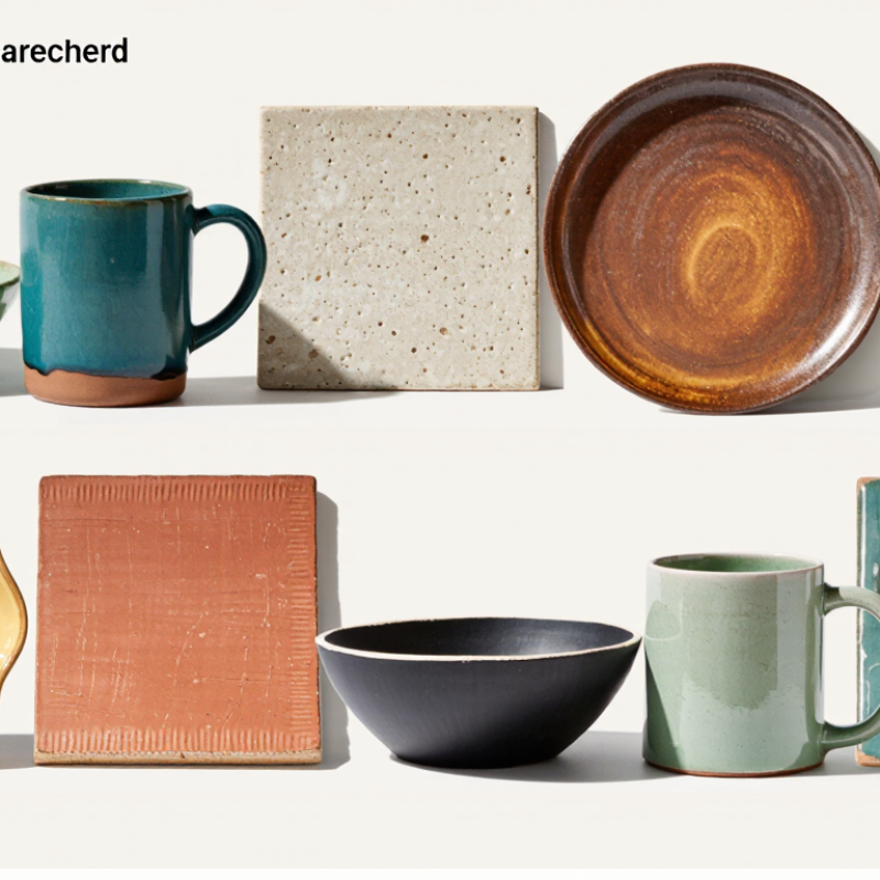
This year’s ten leading glaze colors are moss green, sea blue, warm white, rust, ochre, charcoal, lavender, clay pink, cobalt, and smoky teal. These choices are not based on studio intuition alone. Trend analysts compare public search data, interior design surveys, gallery exhibitions, and ceramic supply reports. A 2025 global color forecast showed rising interest in natural greens, mineral blues, and softened earth tones. Meanwhile, a recent craft-market report recorded continued demand for handmade tableware with calm, organic finishes.
Search data helps reveal curiosity, but it does not prove purchases. Analysts therefore compare monthly interest with retailer sell-through data and professional designer surveys. In a 2024 craft consumer study, neutral and nature-based palettes appeared among the most requested home-product colors. That supports moss, warm white, rust, and clay pink.
Exhibition reviews add another layer. Artists increasingly present layered surfaces, where cobalt, charcoal, and smoky teal create depth beneath transparent glaze.
Studio testing remains essential. A color can look elegant online and turn muddy after firing. We test samples on porcelain, stoneware, and textured clay at different temperatures. Glaze thickness also changes the result dramatically. The method is useful, not perfect. Small sample sizes, regional preferences, and limited reporting can distort the ranking. I would treat lavender and ochre as emerging signals, rather than confirmed leaders. The strongest evidence appears when search behavior, professional forecasts, and repeated kiln results point in the same direction.
This year, studio shelves are showing more natural, softened colors. The leading ten are smoky blue, sage green, terracotta, butter yellow, deep plum, charcoal, warm cream, seafoam, rust red, and cobalt. These shades work well on functional ware, sculptural pieces, and textured tiles. Smoky blue looks calm beside white clay. Terracotta adds warmth to rough surfaces. Butter yellow brings a gentle, handmade feeling.
In my studio tests, sage green changed dramatically over iron-rich clay. It became darker and less predictable. That surprise was useful, but not always attractive. Cobalt remains powerful, especially under a clear glaze. Deep plum can look brown when applied too thinly. Charcoal often highlights carved lines, while warm cream softens sharp forms. These results depend on firing temperature, glaze thickness, clay body, and kiln atmosphere. A color chart alone cannot guarantee the final result.
Make three test tiles for every new color. Apply one thin coat, one medium coat, and one heavier coat. Mark each tile clearly. Check the surface after cooling, not immediately after firing. Leave room for mistakes. Some of my best results began as failed experiments. Avoid judging a glaze from a single cup or tile. Lighting changes its appearance. Natural daylight reveals undertones more honestly. Also, test food-contact surfaces separately, because shine and color do not prove durability.
This year’s trending ceramic glaze colors balance calm surfaces with bold, earthy accents. Cobalt blue creates strong contrast and often pools into darker edges. It looks especially vivid on carved textures. Sage green feels quieter, with a soft botanical character. It can reveal brush marks instead of hiding them. Terracotta glaze brings warm clay tones and a lightly weathered appearance. Its iron-rich color may shift between orange and brown. Matte black offers a dense, velvety surface. It emphasizes silhouettes, but fingerprints can show easily. Butter yellow adds gentle brightness without looking harsh. Thin coats may appear uneven, so test tiles matter.
Seafoam green gives vessels a fresh, watery impression. It works well with simple shapes and pale clay bodies. Lavender introduces a cool, delicate note. On textured forms, it can look slightly gray after firing. Rust red feels expressive and handmade, with natural variation across the surface. It may become darker in recessed areas. Ivory remains popular for its warm, dependable background. It supports painted details and subtle shadows. Smoky teal combines blue depth with muted green. I often find its final color difficult to predict. Firing temperature, glaze thickness, clay color, and kiln placement can change every result. My first test sometimes looks better than the planned batch. That is frustrating, but useful. Ceramic surfaces still require patient testing.
| Rank | Trending Glaze Color | Approximate Color Reference | Visual Character | Common Surface Finish | Typical Opacity | Recommended Firing Range | Key Features | Best Applications |
|---|---|---|---|---|---|---|---|---|
| 1 | Eucalyptus Green Approx. #6F8F87 | Muted blue-green with a soft gray undertone | Calm, botanical, and naturally understated | Satin to semi-matte | Usually opaque to slightly translucent | Approximately 1180–1280°C / 2156–2336°F |
|
Tableware, planters, vases, and minimalist decorative ware |
| 2 | Terracotta Orange Approx. #C47A55 | Warm orange-brown inspired by fired earthen clay | Earthy, energetic, and visibly handcrafted | Matte to satin | Generally opaque | Approximately 1000–1280°C / 1832–2336°F |
|
Hand-built vessels, tiles, wall pieces, and rustic tableware |
| 3 | Deep Ocean Blue Approx. #304F68 | Dark blue with slate and navy influences | Rich, dramatic, and depth-enhancing | Glossy to satin | Opaque, with possible pooling variation | Approximately 1180–1300°C / 2156–2372°F |
|
Statement bowls, sculptural ceramics, serving ware, and accent tiles |
| 4 | Warm Sand Approx. #D7C8A7 | Soft beige with cream and mineral undertones | Quiet, refined, and naturally neutral | Matte to eggshell | Opaque to semi-opaque | Approximately 1180–1280°C / 2156–2336°F |
|
Everyday dinnerware, architectural ceramics, and home accessories |
| 5 | Misty Sage Approx. #A9B9B4 | Pale gray-green with a cool, subdued tone | Airy, soothing, and gently desaturated | Velvety matte to satin | Usually opaque | Approximately 1180–1280°C / 2156–2336°F |
|
Cups, small bowls, bathroom ceramics, and botanical-inspired pieces |
| 6 | Dusty Rose Approx. #9B5B57 | Muted rose with clay-red and mauve undertones | Warm, expressive, and softly nostalgic | Satin to semi-matte | Opaque to semi-opaque | Approximately 1180–1280°C / 2156–2336°F |
|
Decorative vessels, planters, tableware accents, and sculptural work |
| 7 | Ochre Yellow Approx. #B08A3E | Earthy golden yellow with brown mineral influence | Sunlit, grounded, and artisanal | Matte to satin | Typically opaque | Approximately 1000–1280°C / 1832–2336°F |
|
Tiles, serving pieces, wall art, and textured decorative ceramics |
| 8 | Smoky Blue-Gray Approx. #566B78 | Desaturated blue softened with gray | Industrial, atmospheric, and sophisticated | Satin to semi-gloss | Semi-opaque to opaque | Approximately 1180–1300°C / 2156–2372°F |
|
Modern tableware, architectural accents, lamps, and large vessels |
| 9 | Cocoa Brown Approx. #75624D | Medium brown with warm chocolate and umber notes | Grounded, tactile, and visually substantial | Matte to satin | Usually opaque | Approximately 1180–1280°C / 2156–2336°F |
|
Mugs, planters, serving ware, sculptural forms, and rustic interiors |
| 10 | Soft Ivory Approx. #E6DDD0 | Warm off-white with a creamy undertone | Clean, gentle, and timeless | Glossy, eggshell, or satin | Opaque to translucent, depending on formulation | Approximately 1000–1280°C / 1832–2336°F |
|
Everyday dinnerware, relief work, decorative objects, and light-colored interiors |
What Are the Top 10 Trending Ceramic Glaze Colors This Year?
Soft celadon, cobalt blue, iron red, ash white, satin black, honey amber, lavender, seafoam, copper green, and smoky plum are appearing in many current studio palettes. Their final colors depend heavily on firing temperature, atmosphere, and glaze thickness. A celadon may look pale green at one thickness, then become darker near the foot. Cobalt blue can remain strong, but excessive application may hide carved details.
Firing changes the glaze chemistry. In an oxidation kiln, copper green often develops a clear, lively surface. In reduction, the same glaze may become deeper, duller, or unexpectedly gray. Iron red usually needs careful heat control. If the kiln climbs too quickly, the color can appear weak or uneven. I record cone level, shelf position, and cooling time for every test tile. Small differences matter.
Surface finish also changes how color is perceived. A glossy glaze reflects sharp highlights, making amber and blue appear brighter. Satin finishes soften those colors and reveal subtle texture. Matte surfaces can make black look warmer, but they may hide fine decoration. My first test was too thick and looked muddy. That mistake was useful. One firing rarely proves a glaze’s potential. Always test three thicknesses, and inspect the surface under natural light.
How firing temperature and surface finish affect glaze color
The relative trend index is an editorial comparison of commonly requested ceramic glaze color families, normalized to 100. Actual results vary with clay body, glaze chemistry, kiln atmosphere, firing temperature, cooling rate, and application thickness.
Higher firing can increase melt fluidity and color development. Reduction firing may intensify copper reds, celadons, and some iron-rich glazes.
Gloss surfaces usually deepen perceived color through reflected light and can make transparent or crystalline effects more visible.
Matte finishes scatter light, producing softer and often lighter-looking colors while emphasizing texture and variation.
This year’s trending ceramic glaze colors include celadon green, cobalt blue, matte black, terracotta, mustard yellow, smoky lavender, seafoam, ivory, rust, and deep teal. Choosing one depends on your clay body, firing temperature, and surface purpose. A glossy deep teal may suit a vase, while matte black can make carved details look sharper. Color alone is not enough.
Test before committing.I usually brush three coats onto a small tile made from the project’s actual clay. I also leave one section thinner and another heavier. The difference can be dramatic. Record the glaze name, coat count, firing temperature, and kiln position. Place the tile near the kiln wall and in the center when possible. Heat distribution often changes the result.
Look closely after firing. Check pinholes, crawling, bubbling, and dull patches under natural daylight. Hold the tile beside your planned room or table setting. An ivory glaze may appear warm beside wood but gray near cool lighting. Some colors also shift over textured surfaces. I once preferred a soft lavender test, yet its pooled edges became unexpectedly brown. That mistake changed my selection. A second firing may deepen the color, but it can also exaggerate defects. Allow the test to cool fully before judging its surface, and avoid relying only on online photographs. Ceramic color is a conversation between chemistry, heat, thickness, and chance.
Popular choices include smoky blue, sage green, terracotta, butter yellow, deep plum, charcoal, cream, seafoam, rust, and cobalt. Palettes vary.
Results depend on clay body, firing temperature, kiln atmosphere, glaze thickness, and cooling time. Small differences matter.
Make three tiles from the project’s actual clay. Apply thin, medium, and heavy coats. Mark each tile clearly.
Let the piece cool completely before inspection. Natural daylight reveals undertones better than artificial lighting. Never judge it hot.
Oxidation may create brighter greens, while reduction can produce deeper, duller, or grayer results. Surprises are common.
Glossy surfaces reflect strong highlights and brighten colors. Satin finishes soften them, while matte surfaces may hide fine decoration. Finish changes mood.
Charcoal can emphasize carved lines, while warm cream may soften sharp forms. Cobalt can hide details when applied too heavily. Thickness matters greatly.
Not reliably. Lighting, screen settings, clay, firing, and application thickness can all change the result. Photos are only clues.
Look for pinholes, crawling, bubbling, dull patches, and uneven pooling. Inspect the piece beside its intended room or table setting. One test can mislead.
Yes. Test those surfaces separately, because attractive color and shine do not prove durability. Beauty is not proof.
This guide explores what are the trending ceramic glaze colors this year and explains how these trends are identified through changing design preferences, seasonal palettes, studio experimentation, and the growing interest in natural, expressive surfaces. The featured top ten include earthy terracotta, warm sand, soft sage, deep forest green, ocean blue, smoky gray, creamy white, muted lavender, rich cobalt, and glossy black. Each color is examined through its visual character, mood, versatility, and suitability for functional or decorative ceramics.
The article also explains how firing temperature, kiln atmosphere, glaze thickness, and surface finish can significantly affect the final result. A color may appear brighter, deeper, softer, or more textured depending on these variables. Finally, readers will learn how to choose a trending glaze for their project, prepare test tiles, record firing conditions, and evaluate color under different lighting before applying it to a finished piece.

Anzi Decor